Our Top Email Design Pick for July
Email Design Trending Now: Triple Black and White
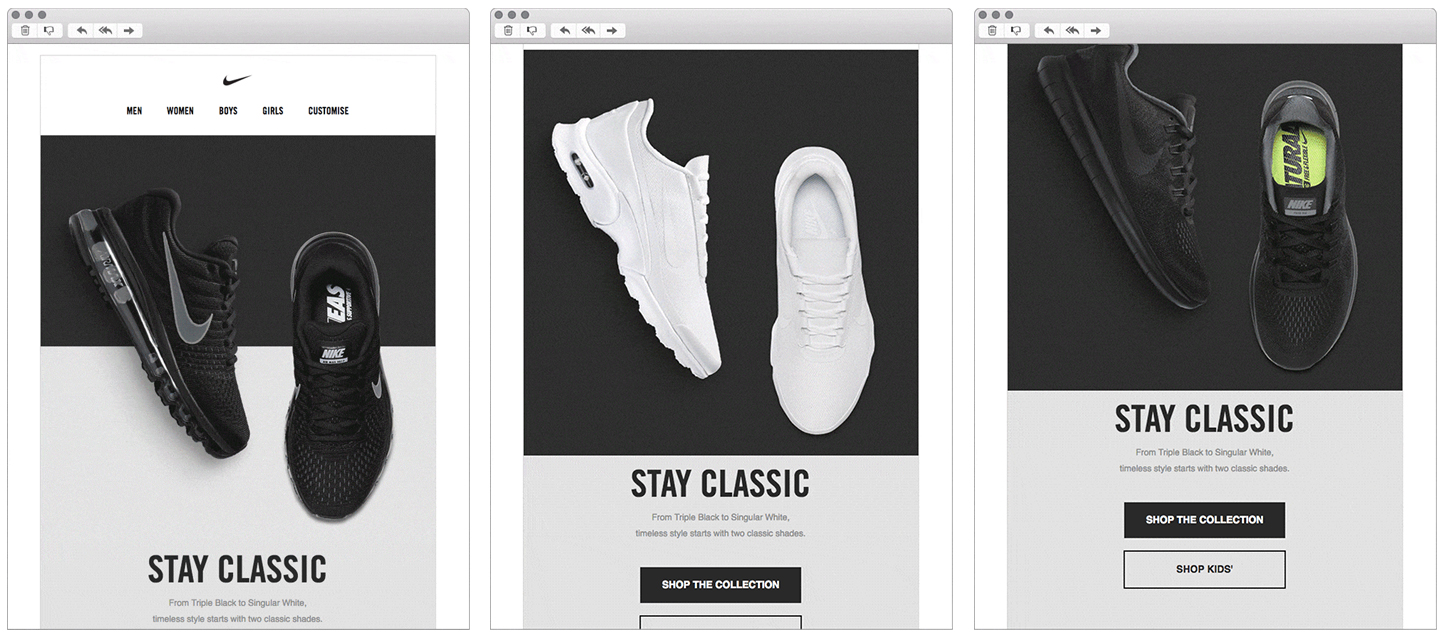
This month’s top pick is an example of a classic email design for a timeless shoe. We love the monochrome style that is used to emphasize the interesting animation and the three different styles in a sleek fashion. This also transitions well on mobile.
The design is eye-catching without the use of any bright colours, big typography or illustrations in the background.
Nike, Just do it!

Let’s get started
Need a little help to create beautiful and engaging designs for your email campaign? Digital Fire is a full service digital marketing agency that work on multiple local and international clients. Give us a call for a no-obligation quote.
Image source: http://www.emaildesignreview.com/email-design-inspiration/sophies-top-designs-for-august-3307/


