Our creepy & mysterious Halloween Email design Picks for October👻
Are you scared yet? These ghoulish and mysterious email design picks have fun with our scariest observance of the year. Read more if you dare!
-
Interactive Halloween fun
This mailer from EmailMonks has it all. Strong visuals, clear messaging and a bonus interactive element. Showcasing their template to its full gory glory, this mailer combines the theme of Halloween with a pitch, without being too salesy.
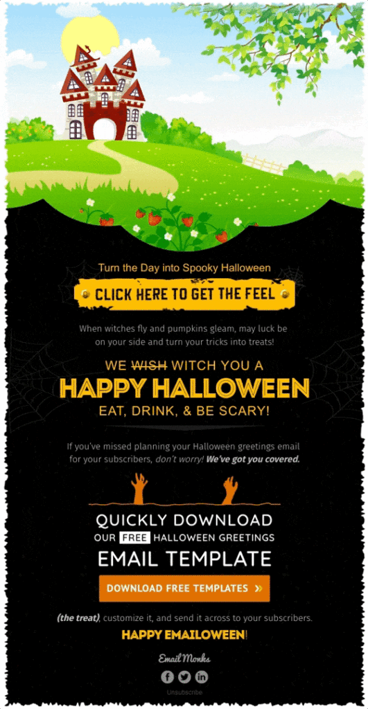
Witching you Happy Halloween! Image via reallygoodemails.com
-
Witty (or is it witchy) repertoire
How many puns are too many puns? None. This witty and tongue-in-cheek campaign copy perfectly frames the classy, yet slightly cliché, Halloween themed clothes from Modcloth. The mailer isn’t anything we haven’t seen before, but the sharp copy and puns will have us in stiches for a long time to come. Shop the boo-tique!
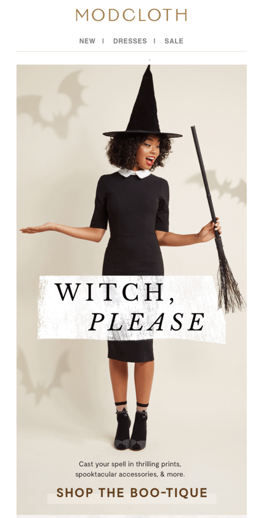
Don’t let Halloween sneak up on you. Image via reallygoodemails.com
-
Seriously scary – embracing Halloween’s scare factor
With a lot of brands creating kid-friendly and cutesy Halloween creative to appeal to the mass market, we have to give kudos to those who fully embrace the scary for their Halloween campaigns. Traditionally a dark and ambiguous observance, these brands are standing out by simply staying true to Halloween’s original roots – scare factor.
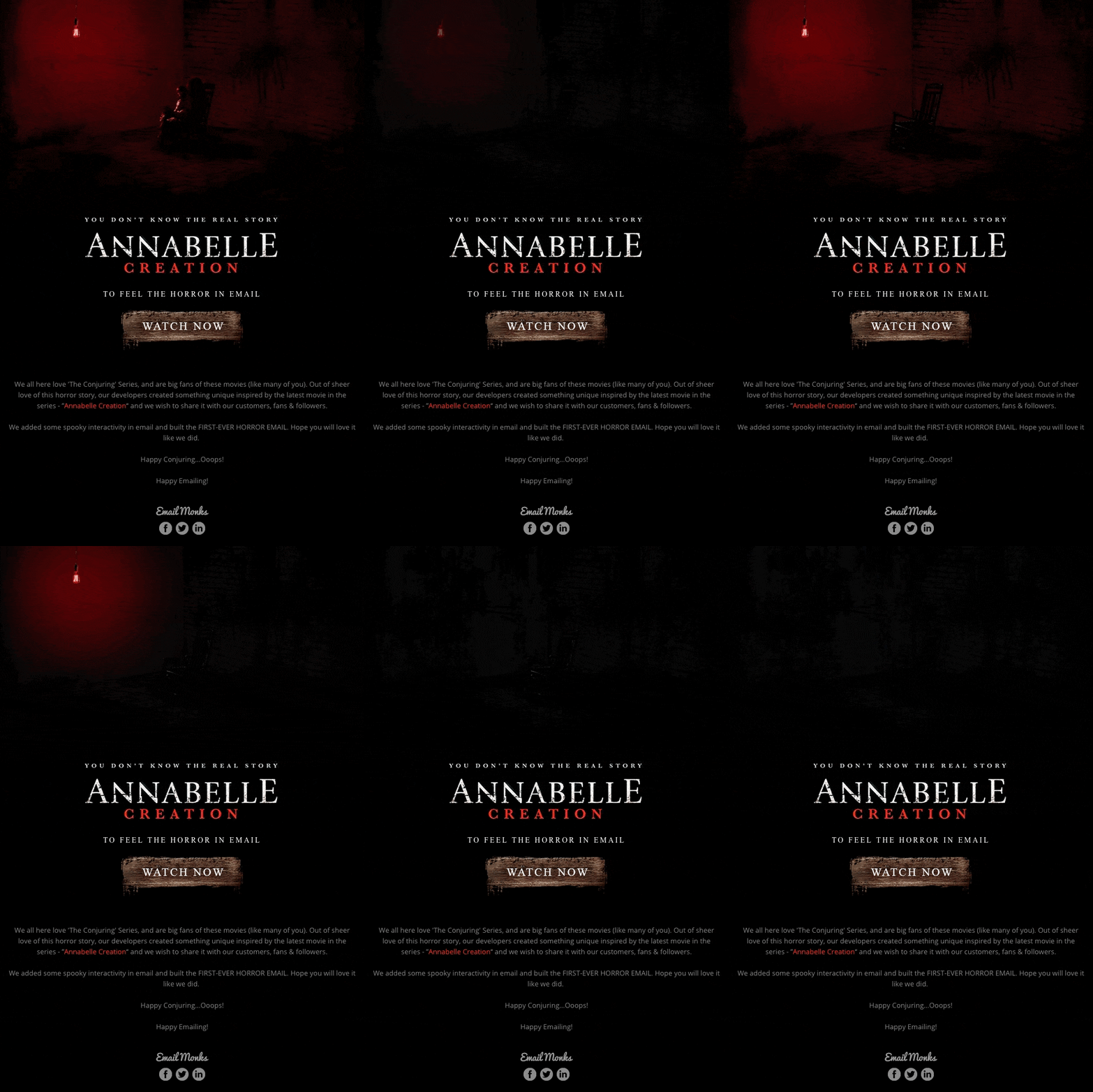
Truly spooky, watch at your own risk! Image via reallygoodemails.com
Still want to scare up some business for Halloween?
Design, setup and broadcast your Halloween campaign in just 5 days with our in-house design and production team. Digital Fire is a full-service digital marketing agency that works on multiple local and international clients and specialises in getting emails in inboxes. Give us a call for a no-obligation quote.
Email Design Picks Source:

