Responsive Email Design for iPhone 6 and 6 Plus
More email is read on mobile than on a desktop email client. Stats say 48% of email is now opened on a mobile device Litmus –”Email Analytics” (Jan 2015).
The mobile breakdown is as follows: 49.5 percent of email opens were on a smartphone, 16.8 on a tablet. Of the 66 percent of mobile opens, 58 percent happened on an Apple device; 7 percent were on Android devices. (Q4 2014)
Responsive email
As the open rate in mobile email increases, a responsive email approach should be adopted. A responsive email/newsletter design enables readability on multiple devices. Responsive email design leads to an increase in customer sales.
On mobile phones, email marketing generated 26.7% of sales, compared to 20.9% on desktop and 23.1% on tablet. – Custora “E-commerce Pulse Mobile report” (2014)
Another interesting finding in the report involves the time and day of email opens. The highest open rates on the PC happen Monday through Wednesday. On mobile devices, however, it’s Friday through Sunday. That implies a different strategy and delivery approach based on email content or consumer buying patterns. (Q4 2014)
Smartphones and tablets also showed different open patterns. Most opens on smartphones happened in the morning between 6 am and 9 am, while tablet opens were concentrated at night after 6 pm.
46% of consumers says if Newsletters are too poorly designed to be read on a smartphone, it reduces the chance they buy something from the vendor – Apsis “The email Barometer, Email on mobile devices” (2013)
Email design and coding
When coding in ‘break points’ the HTML will adapt based on the width of a screen. For email, it is common to use 2 break points: one between mobile and tablet and another one between tablet and desktop. Knowing these display specifications allows coders to design in such a way that an email marketing email or newsletter displays responsively.
What that means for email designers, previous iPhone users with devices of 320px wide will have to be adjusted to iPhones that are effectively 360px, 375px or 414px wide. By achieving this; email marketers are able to display across multiple platforms and reach a wider audience.
Breakpoints: A break point is the width at which the layout of the email ‘breaks’ or moves from one layout to another.
The reason for determining breakpoints is because of the way in which content is displayed. Content on a monitor will not work well on a mobile device if it does have any breakpoints. The break point is usually defined by a specific width, or range of widths, in pixels.
For example, if an email’s HTML has a breakpoint of 320px, it would display one layout at widths under 320px and another layout at widths above 320px.
(e.g. an iPhone 6 has a resolution of 1134 x 750 pixels).
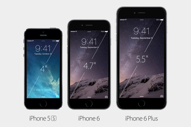
Responsive Design iPhone 6
Resolution: Is the number of physical pixels across a device’s width and height.
PPI: PPI stands for “pixels per inch.” A List Apart describes a pixel as the “smallest point a screen can physically display,” essentially a tiny dot emitting light from your screen.
(e.g. 1134px by 750px resolution on a 4.7 inch screen will give a 325.61 ppi (pixel density).
So, If the screen size increases with the same resolution, then the ppi will decrease. If the screen size decreases with the same resolution, then the ppi will increase.
Device Pixel Ratio: The ratio between physical pixels and how the device defines and uses pixels.
(e.g. In email, the device-pixel-ratio is used to target devices using media queries).
The iPhone changes in display
- The width of the iPhone 6 and iPhone 6+ display.
- The diagonal measurement of the physical screen in inches.
- The resolution is the number of pixels on the screen.
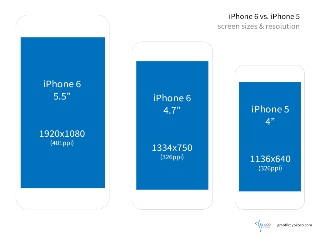
Only four years apart between the first release of the first iPhone 4 and the iPhone 5. Not much difference in screen size since the iPhone 4. Below are the display differences in inch and ppi sizes.
| iPhone 4 | iPhone 5 | iPhone 6 | iPhone 6+ |
| 3.5 inch display | 4 inch display | 4.7 inch display | 5.5 inch display |
| 960 x 640 pixels | 1136 x 640 pixels | 1334 x 750 pixels | 1920 x 1080 pixels |
Examples of responsive emails:

Screen Sizes: iPhone Display
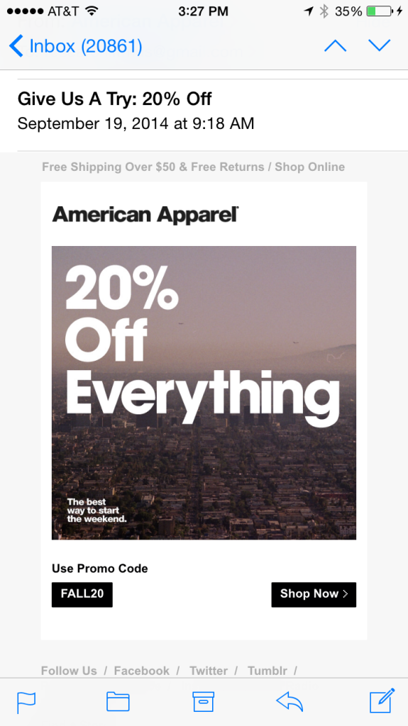
The display clearly shows a full on display that fills the entire screen. To see more, one would need to scroll down further.
iPhone 5
Litmus.com
The display clearly shows a full on display that fills the entire screen. To see more, one would need to scroll down further.
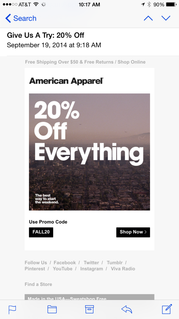
iPhone 6
Litmus.com
The second display is that of the iPhone 6, more text is displayed here than that of the iPhone 5.
iPhone 6+
Litmus.com
The display on the iPhone 6+ takes advantage of the bigger screen size, more of the text and images can be displayed.
There are different ways to address the new screen sizes:
- Coders and Email designers should start designing for the width of the iPhone 6 (using 375px), where content for older devices will be scaled down to 320px.
- Introduce an extra ‘break point’ at 375px and/or 414px.
- Use fluid design for resizing between break points.